Year
2025

Project Overview
A financial management platform for the Regional Government of the Azores, covering supplier and salary payments, payment history, transactions, bank accounts, current accounts, virtual accounts, and application settings.
Over one year, I designed the entire platform from start to finish, following the GRA Design System to create a consistent experience across all modules.
A financial management platform for the Regional Government of the Azores, covering supplier and salary payments, payment history, transactions, bank accounts, current accounts, virtual accounts, and application settings.
Over one year, I designed the entire platform from start to finish, following the GRA Design System to create a consistent experience across all modules.
Technology
Figma, Outsystems


Objective
My goal was to make complex financial operations clear and manageable, helping government staff process payments, consult financial records, and manage accounts through a cohesive interface aligned with the GRA Design System.
My goal was to make complex financial operations clear and manageable, helping government staff process payments, consult financial records, and manage accounts through a cohesive interface aligned with the GRA Design System.
Problem and Solution
Problem
The main design challenge was to bring together a broad range of financial operations within a single, coherent platform. Supplier payments, salary processing, payment enquiries, transaction records, and different account types each required distinct workflows and information structures.
The interface needed to accommodate this complexity while making it clear what users were viewing, which actions were available, and how to move through each task. Financial information also required a clear visual hierarchy, allowing users to distinguish key details from supporting data.
Alongside these requirements, the entire experience had to follow the GRA Design System, maintaining consistency across modules with very different purposes.
Solution
Over one year, I designed the platform from start to finish, translating its functional requirements into structured screens and connected workflows. I organised the experience around its core areas: payments, financial enquiries, account management, and application settings.
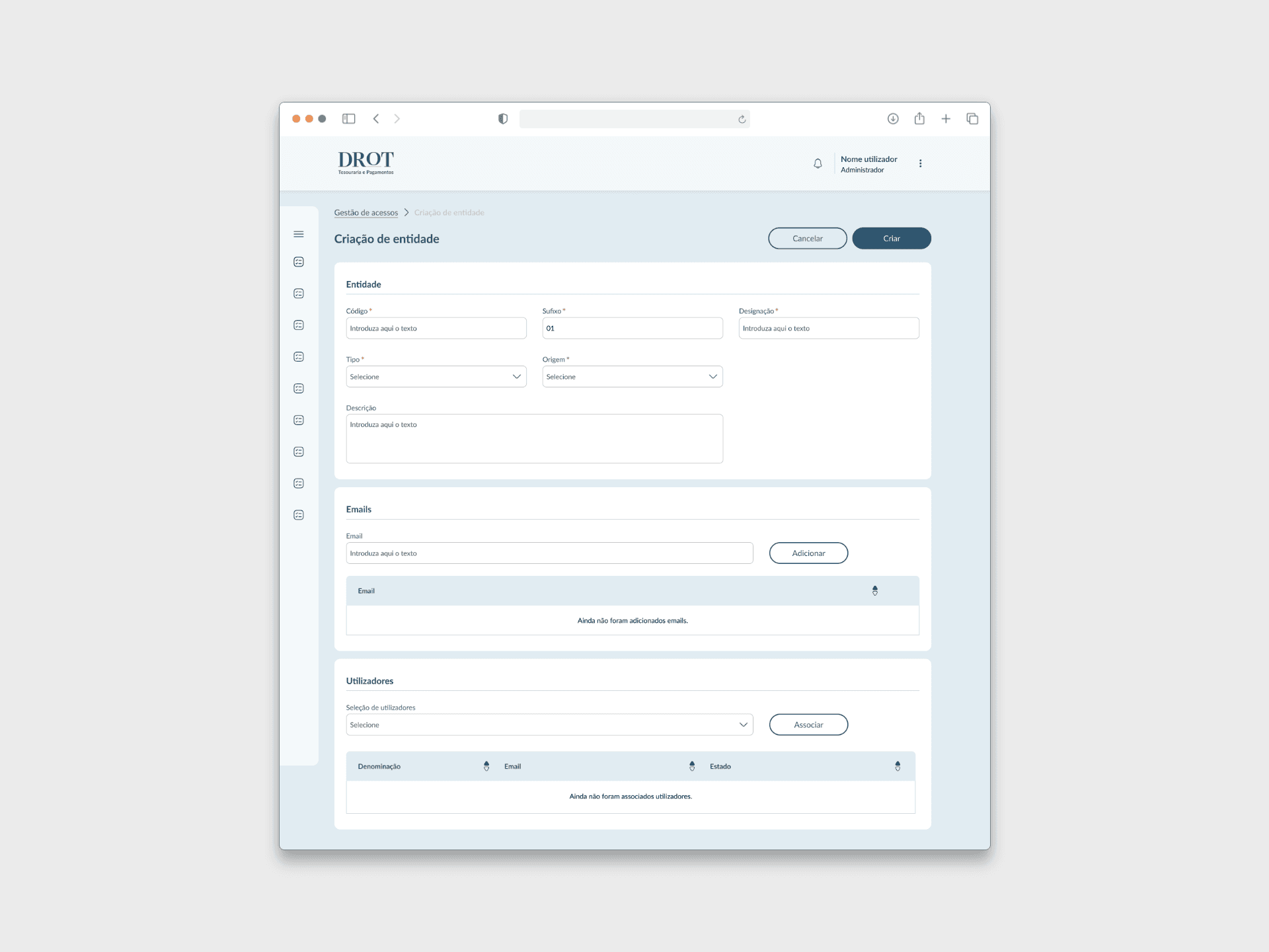
Within each area, I focused on clear navigation, readable information, and a consistent placement of actions. Tables, forms, and detail views followed shared design patterns, giving users a familiar structure as they moved between tasks while accommodating the specific requirements of each module.
Using the GRA Design System as the foundation, I brought these different workflows together into a cohesive interface. The design aimed to make a complex financial platform easier to navigate, helping staff understand the information in front of them and identify their next step.
Problem
The main design challenge was to bring together a broad range of financial operations within a single, coherent platform. Supplier payments, salary processing, payment enquiries, transaction records, and different account types each required distinct workflows and information structures.
The interface needed to accommodate this complexity while making it clear what users were viewing, which actions were available, and how to move through each task. Financial information also required a clear visual hierarchy, allowing users to distinguish key details from supporting data.
Alongside these requirements, the entire experience had to follow the GRA Design System, maintaining consistency across modules with very different purposes.
Solution
Over one year, I designed the platform from start to finish, translating its functional requirements into structured screens and connected workflows. I organised the experience around its core areas: payments, financial enquiries, account management, and application settings.
Within each area, I focused on clear navigation, readable information, and a consistent placement of actions. Tables, forms, and detail views followed shared design patterns, giving users a familiar structure as they moved between tasks while accommodating the specific requirements of each module.
Using the GRA Design System as the foundation, I brought these different workflows together into a cohesive interface. The design aimed to make a complex financial platform easier to navigate, helping staff understand the information in front of them and identify their next step.
Gonçalo Perdigão
Gonçalo Perdigão
Gonçalo Perdigão